Overview Skills Experience Contact
Enterprise Analytics & Data Strategy Leader · 20+ Years

Dilshad Yousuff

Building the analytics functions that compound - platforms, frameworks, and teams that keep producing better decisions.

Enterprise Analytics and Data Strategy leader with 20+ years across Google Cloud, Mandiant, and McAfee - architecting self-service BI platforms, Revenue Walk frameworks, and the data infrastructure that Finance, Sales, and Product leadership rely on to plan, forecast, and grow.

Download Resume

By the Numbers

20+

Years delivering actionable BI across Finance, Product, and Sales

1k+

Global users on Looker dashboards built at Google Cloud

40%

Query performance improvement via BigQuery optimisation

60%

Reduction in dashboard refresh time at Mandiant

Power BI· Looker· BigQuery· Python· Revenue Analytics· ARR · MRR · NRR· ETL Pipelines· Data Warehousing· SQL· Tableau· Google Cloud Platform· LookML· DAX· Cohort Analysis· Predictive Modelling· Power BI· Looker· BigQuery· Python· Revenue Analytics· ARR · MRR · NRR· ETL Pipelines· Data Warehousing· SQL· Tableau· Google Cloud Platform· LookML· DAX· Cohort Analysis· Predictive Modelling·

Not just dashboards, the infrastructure that makes them trustworthy, scalable, and acted upon.

My career sits at the intersection of engineering precision and business strategy. I build analytics functions from the ground up - the platforms, frameworks, and teams that give Finance, Sales, and Product leadership the information they need to make consequential decisions.

From directing the M&A data integration of Mandiant into Google Cloud with full DOJ regulatory compliance, to building a Revenue Walk framework now used in CFO-level quarterly reviews, my work is defined by impact that outlasts any single project.

BI & Visualisation

Power BI · Looker · Tableau · OBIEE · DAX · LookML

Revenue Analytics

ARR · MRR · NRR · Churn · Retention · Expansion · Revenue Walk

Data Engineering

BigQuery · SQL Server · ETL Pipelines · Datamart Architecture · Data Warehousing

Programming

SQL · Python · DAX · LookML · Statistical Modelling · Predictive Analytics

Cloud Platforms

Google Cloud Platform · BigQuery · Salesforce · SQL Server

Product Analytics

Funnel Analysis · Cohort Analysis · A/B Testing · Feature Adoption · User Behaviour

Nov 2022 – Dec 2025

Google Cloud

Google

Manager, Finance Business Intelligence

  • Directed the post-acquisition integration of Mandiant's data infrastructure into Google Cloud, coordinating Finance, Product, Engineering, and Data teams across jurisdictions with 100% data integrity, full DOJ regulatory compliance, and zero disruption to business reporting.
  • Architected a self-service BI platform on Looker and BigQuery adopted by over 1,000 global Finance users, covering product performance, customer behaviour, and enterprise KPI reporting.
  • Built the Revenue Walk framework tracking ARR progression, churn, expansion revenue, and product performance drivers, adopted by Finance leadership as the standard model for quarterly business reviews and board-level strategic planning.
  • Improved BigQuery query performance by 40% through query tuning, partitioning, and ETL restructuring, and adopted Gemini and AI-assisted tooling to accelerate analytics delivery.

Dec 2014 – Oct 2022

Mandiant

formerly FireEye

Manager, Strategy & Analytics

  • Led revenue and product analytics across 2,000+ enterprise customers on a $200M+ ARR base, building forecasting models, executive QBR reports, customer segmentation analysis, and SaaS KPI frameworks.
  • Drove an 8% reduction in enterprise churn through targeted retention analytics, cohort modelling, and early-warning dashboards that enabled account teams to intervene proactively ahead of renewal risk.
  • Hired, structured, and mentored an analytics team of five, establishing self-service reporting standards and structured stakeholder engagement across Finance, Sales, and Product.
  • Designed scalable ETL pipelines consolidating eight data sources into centralised datamarts, cutting dashboard refresh times by 60% and creating a single source of truth across Finance, Sales, Marketing, Channel, and Product.

Jun 2007 – Dec 2014

McAfee

Intel Security

Technical Lead, Reporting & Analytics

  • Built and maintained executive reporting covering bookings, pipeline, forecast accuracy, and quota attainment for over 200 global sales representatives.
  • Automated dashboard and reporting infrastructure, reducing report turnaround time from four hours to 15 minutes and giving sales leadership real-time visibility into business performance.
  • Partnered with Sales, Marketing, Finance, and IT to standardise data integration and establish a unified reporting framework across global operations.

Get in Touch

Let's build something that matters.

Open to Senior Manager, Director, and Head of Analytics roles in Bangalore, Hyderabad, and Dubai. Available for relocation or global remote.

About

20+ years of
analytics, strategy,
and impact.

Dilshad Yousuff
Bangalore, India
+91 98459 76468
Google Data Analytics IBM Data Science

Who I am

I'm an Enterprise Analytics and Data Strategy leader with over 20 years building BI functions from the ground up - the platforms, frameworks, and teams that give Finance, Sales, and Product leadership the information they need to make consequential decisions.

My career spans three of the most demanding environments in enterprise tech - Google Cloud, Mandiant, and McAfee, where I built analytics ecosystems that operated at scale: self-service BI platforms adopted by over 1,000 global users, Revenue Walk frameworks used in CFO-level quarterly reviews, and ETL pipelines that consolidated eight data sources into a single source of truth.

What I specialise in

Revenue and SaaS analytics is my deepest domain. ARR, MRR, NRR, churn modelling, expansion revenue, retention cohorts. I've built the models and frameworks that give Finance and strategy teams real visibility into what drives growth and what erodes it.

I also lead at the intersection of engineering and business strategy: designing governed self-service BI ecosystems that non-technical stakeholders can trust, directing M&A data integrations with regulatory compliance requirements, and developing analytics teams that deliver work that outlasts any single project.

Currently open to Senior Manager, Director, and Head of Analytics roles in Bangalore, Hyderabad, and Dubai.

Education

Bachelor of Engineering, Electrical & Electronics - Bangalore University (1998–2002)

IBM Data Science and Google Data Analytics certifications reflect a commitment to staying current in a field that moves fast.

Case Studies & Projects

Projects &
Analysis

A selection of data analysis, machine learning, and BI work — each built to solve a real problem, not just demonstrate a skill.

Revenue Analytics • Excel • Power Query • DAX

SaaS Revenue Analytics Dashboard

Enterprise-grade Revenue Analytics solution built using synthetic SaaS subscription data. Includes ARR, MRR, NRR, GRR, churn analysis, cohort retention, customer segmentation, revenue movement analysis, executive KPIs and forecasting.

Aviation Analytics · ML

Airline Operations Analysis

Operational analytics and predictive modelling for airline delays, utilisation, fuel efficiency, and passenger intelligence.

ML Analytics · Predictive Modeling · Executive BI

YouTube Analytics Intelligence Dashboard

Streamlit dashboard with 3 ML prediction models (virality, performance, views), 5 custom strategic KPIs, publishing optimisation heatmaps, and benchmarked content recommendations.

E-Commerce BI · AI Insights · Streamlit

E-Commerce C-Suite Intelligence Dashboard

5-page Streamlit dashboard covering revenue, operations, profitability, and AI-generated board insights — with Claude AI / GPT-4o integration and multi-source data ingestion.

Tableau · Sales Analytics · Executive BI

Sales & Customer Performance Dashboard

Executive sales intelligence dashboard analysing revenue performance, customer profitability, discount impact, YoY growth, and product trends through interactive Tableau analytics.

EDA · Machine Learning · Python

Bike Sharing Analysis & Demand Prediction

Exploratory analysis of 5.7M Divvy trip records to uncover rider behaviour patterns across member and casual segments — plus a Random Forest model to forecast ride demand.

Case Study · EDA & Machine Learning

Bike Sharing
Analysis

Exploratory data analysis of 5.7M Divvy trips to uncover rider behaviour patterns between annual members and casual riders — culminating in a Random Forest demand prediction model.

DatasetDivvy Trip Data
Records5.7M rows
StackPython · Scikit-learn
TypeCapstone Project
01

Business Context

Cyclistic (fictionalised as Divvy) operates a 5,800-bike network across Chicago. The core business challenge: casual riders generate lower per-trip revenue than annual members. The analytics goal was to characterise the behavioural differences between the two segments and identify conversion opportunities.

5.7MTrip records
12Months of data
2Rider segments
3Bike types
02

Data Preparation

Raw data arrived across 12 monthly CSVs, each with identical schema. After concatenation, the cleaning pipeline addressed structural and quality issues before engineering features for analysis.

ride_id rideable_type started_at / ended_at start / end station lat / lng coordinates member_casual ride_length ← derived distance_km ← derived
  • 1

    Handle missing values

    Null station names and IDs were identified and removed. Records missing geographic coordinates were dropped to preserve distance calculation integrity.

  • 2

    Datetime conversion & validity filtering

    All timestamps parsed to datetime. Rides with zero or negative duration were excluded as docking artefacts. Outliers at extreme durations (>24 hrs) were capped.

  • 3

    Feature engineering

    Derived ride_length (minutes), distance_km (via geopy Haversine), plus hour, day_of_week, month, and seasonal aggregates from timestamps.

03

Exploratory Analysis

EDA revealed distinct behavioural profiles between members and casual riders — a finding with direct implications for fleet allocation and marketing strategy.

🚴

Members ride short, ride often

Annual members make frequent, short trips — strong evidence of daily commuting. Peak activity aligns with 8–9 am and 5–6 pm.

🌅

Casual riders prefer weekends

Casual users take longer, leisure-oriented rides concentrated on Saturday and Sunday. Average duration is nearly 2× that of members.

Electric bike adoption rising

E-bikes showed consistent month-over-month growth. Casual users disproportionately favour e-bikes vs classic bikes.

📅

Clear seasonal demand curve

Ride volume peaks June–August and troughs in winter. Member usage is more stable; casual usage is highly seasonal.

Avg. ride duration by segment and day type

Members Weekday
~13 min
Short
Members Weekend
~18 min
Moderate
Casual Weekday
~26 min
Long
Casual Weekend
~36 min
Longest

Key Insight

The member vs. casual split is the single most predictive variable — not just for duration, but also station preference, time-of-day demand, and bike type choice. Any operational model should treat these as two entirely separate demand curves.

04

Predictive Modelling

Two regression approaches were benchmarked against the same held-out test set to forecast ride demand using temporal and categorical features.

Model MAE RMSE Notes
Linear Regression Higher Higher Struggled with non-linear seasonal patterns
Random Forest Best 110.47 171.39 Captured temporal interactions and segment-level variance well

Random Forest outperformed linear regression by capturing non-linear interactions between hour-of-day, day-of-week, and user type. The MAE of ~110 seconds (~1.8 min) is operationally useful for redistribution planning.

On the RMSE

An RMSE of ~171 seconds suggests the model captures broad demand shape well but struggles with outliers (long leisure rides by casual users). Separate models per segment would likely reduce this variance by 15–25%.

05

Business Recommendations

1
Segment-aware redistributionPre-position bikes at transit hubs before 8 am and 5 pm for members; increase capacity at leisure stations on weekend mornings for casual riders.
2
Casual-to-member conversionCasual riders with 4+ weekend rides/month are high-conversion targets. In-app prompts at ride end could meaningfully increase annual subscriptions.
3
Expand e-bike fleet on casual routesGiven the preference for e-bikes among casual users on longer routes, fleet investment should weight e-bikes toward tourist-corridor stations.
4
Winter demand stabilisationThe sharp winter trough is partly addressable through seasonal pricing incentives. Retaining casual riders in shoulder seasons (April, October) smooths the revenue curve.
06

Limitations & Future Work

No weather data

Temperature and precipitation are likely among the strongest demand drivers. Integrating weather API data would materially improve accuracy.

No holiday calendar

Public holidays spike casual usage in ways the current model can't anticipate. A binary holiday feature would resolve this.

Single-segment model

Training one model for both user types introduces noise. Separate models would likely improve RMSE by 15–25%.

Future iterations could explore gradient boosting (XGBoost/LightGBM), time-series forecasting (Prophet/ARIMA) for station-level demand, and geospatial clustering to identify underserved corridors.

07

Stack & Methods

PythonCore language
PandasData wrangling
NumPyNumerical ops
GeopyHaversine distance
MatplotlibVisualisation
SeabornStatistical plots
Scikit-learnML models
JupyterNotebook env
Exploratory Data Analysis Feature Engineering Regression Modelling Model Evaluation Data Storytelling Geospatial Distance

Google Data Analytics Certificate capstone · Divvy trip data

View on GitHub
Aviation Analytics · Executive Intelligence Platform

Airline Executive
Analytics Platform

Enterprise-grade aviation analytics platform combining commercial, operational, fleet, passenger, sustainability, forecasting, and AI-driven insights into a unified executive decision-support system.

Role BI & Analytics Lead
Industry Airlines & Aviation
Scope Executive BI · Forecasting · KPI Intelligence
Tools Python · Streamlit · Plotly · Pandas
01

Executive Business Challenge

Airline leadership teams must balance profitability, operational performance, fleet utilisation, customer experience, and sustainability goals— often across thousands of flights and multiple business units.

Traditional reporting environments provide siloed metrics, making it difficult to understand the relationships between revenue, operations, fleet health, passenger demand, and environmental performance.

This project delivers a unified Airline Executive Analytics Platform that consolidates commercial, operational, fleet, passenger, sustainability, forecasting, and AI-driven insights into a single decision-support environment.

15K+ Flights Analysed
5 Years Historical Data
6 Executive Modules
50+ Operational KPIs
02

Platform Architecture & Data Model

The platform was designed as a multi-domain executive intelligence environment that integrates commercial performance, operations, fleet management, passenger analytics, sustainability monitoring, forecasting, and AI-generated recommendations.

Commercial Analytics Operations Command Center Fleet Performance Passenger Insights Sustainability Forecasting Engine AI Insights Alert Monitoring
  • 1

    Data Integration & KPI Engineering

    Built a unified aviation dataset covering commercial, operational, passenger, fleet, and sustainability metrics with executive-level KPI calculations.

  • 2

    Forecasting & Analytics Layer

    Developed forecasting capabilities, airline health scoring, trend analysis, and operational performance monitoring.

  • 3

    Executive Dashboard Experience

    Delivered a modern Streamlit platform with interactive visualisations, AI-generated insights, and executive-level reporting views.

03

Executive Dashboard Modules

The platform consists of multiple executive workspaces covering every major dimension of airline performance.

💰

Commercial Analytics

Revenue performance, profitability, passenger yield, route economics, and commercial trend analysis.

✈️

Operations Command Center

OTP, delays, cancellations, completion rates, and operational risk monitoring.

🛩️

Fleet Performance

Aircraft utilisation, fleet profitability, maintenance efficiency, and asset performance tracking.

👥

Passenger Insights

Load factors, occupancy, passenger behaviour, demand analysis, and route utilisation.

🌱

Sustainability Analytics

Fuel burn, carbon emissions, environmental KPIs, and sustainability performance.

🤖

Forecasting & AI Insights

Predictive forecasting, health scores, executive recommendations, and trend projections.
04

Business Value Delivered

1
Executive KPI Visibility Provides leadership with a single source of truth for airline performance monitoring.
2
Proactive Risk Identification Alert monitoring and operational intelligence help identify emerging performance issues early.
3
Forecast-Driven Decision Making Future performance projections support capacity planning and strategic investments.
4
Cross-Functional Alignment Commercial, operational, passenger, fleet, and sustainability teams operate from a shared analytics framework.
05

Technology Stack

Python Core Analytics
Streamlit Executive Dashboard
Plotly Interactive Visualisation
Pandas Data Processing
NumPy Statistical Computing
Scikit-Learn Predictive Analytics
AI Insights Executive Recommendations
Forecasting Engine Trend Projection
Alert Engine Operational Monitoring
View on GitHub View Dashboard
Creator Analytics · Executive Dashboard

YouTube Analytics
Intelligence Dashboard

A production-grade Streamlit analytics platform for YouTube channel intelligence — featuring 6 interactive analysis tabs, 5 custom strategic KPIs, 3 Random Forest ML models, hour × day publishing heatmaps, and data-driven content recommendations. Connects to the YouTube Data API v3 or runs on a 2,000-video synthetic dataset.

Dataset 2,000 Videos · 50 Channels
Data Source YouTube Data API v3 · Synthetic Sample
Stack Python · Streamlit · Scikit-learn · Plotly · Pandas
ML Models Random Forest — Virality · Performance · Views
01

Business Problem

YouTube channels generate enormous volumes of performance data, yet native platform analytics lack the depth needed for strategic decisions. Creators and media teams cannot easily identify what drives virality, when to publish for maximum reach, or how their KPIs compare to top performers — without custom tooling.

This dashboard solves that gap by connecting directly to the YouTube Data API v3 (or running on a 2,000-video synthetic dataset), engineering 25+ analytical features, and exposing six dedicated analysis modules — from executive KPI summaries to ML-powered predictions and prescriptive recommendations.

2K Videos in sample dataset
50 Channels tracked
6 Interactive analysis tabs
85%+ ML model accuracy
02

Technical Architecture

The app fetches channel and video-level data via the YouTube Data API v3, parses ISO 8601 durations into minutes, applies safe division handling for zero-view videos, and engineers 25+ features covering engagement rates, virality indices, performance categories, and posting patterns. A fallback synthetic dataset (2,000 videos · 50 channels) ships with the app, generated with a fixed seed for reproducibility.

views · likes · comments publish_date · duration_minutes channel_id · subscribers engagement_rate ← derived virality_index ← derived performance_category ← Q1/Q3 split views_per_day · publish_hour ← derived
  • 1

    API ingestion & feature engineering

    YouTube Data API v3 fetches channel stats and video-level metadata. ISO 8601 timestamps are parsed with regex into decimal minutes. 25+ features are engineered: engagement rate, like rate, comment rate, views per day, publish hour/day/month, and posting period buckets (Morning / Afternoon / Evening / Night).

  • 2

    ML model training & validation

    Three Random Forest models are trained on the engineered feature set: a classifier for virality (viral vs non-viral), a classifier for performance category (High / Medium / Low based on Q1/Q3 view thresholds), and a regressor for view count prediction. All models use a 70/30 train-test split with StandardScaler normalization, and expose feature importance rankings for interpretability.

  • 3

    6-tab Streamlit interface

    The dashboard exposes six dedicated tabs: Overview & KPIs, Growth & Engagement, Video Performance, Content Strategy, Predictions, and Recommendations. All charts use Plotly for interactivity, with smart K/M/B number formatting, sidebar filters for channel, date range, and performance category, and a dark sidebar contrasted against a light main canvas.

03

Key Dashboard Features

The dashboard's Overview tab surfaces five custom strategic KPIs not available in native YouTube Studio — each with a defined formula and benchmark for performance evaluation. Subsequent tabs drill into growth trends, video-level performance, publishing strategy, ML predictions, and prioritised recommendations.

🎯

Video Efficiency

Views per minute of content per 1,000 subscribers — normalises performance across channels of different sizes and content lengths.

💬

Audience Interaction Score

Composite of like rate (×0.5) and scaled comment rate (×0.5) — captures both passive approval and active audience participation.

📊

Creator Consistency

100 minus the coefficient of variation in views per channel — rewards stable performance over erratic viral spikes.

🚀

Virality Index & Content Quality Score

Virality = views per 100 subscribers. Quality = weighted composite of normalised like rate (40%), comment rate (30%), and views per day (30%) — scored out of 100.

Tab Breakdown

Overview & KPIs — executive summary + 5 KPIs + engagement trend + performance donut · Growth & Engagement — monthly views + top-10 channels + engagement distribution + duration scatter · Video Performance — top 20 videos table + duration bucket analysis + radar chart · Content Strategy — hour × day publishing heatmap + posting period analysis · Predictions — 3 Random Forest models with feature importance · Recommendations — benchmarked improvement actions vs top-25% performers.

04

Business Impact

1
Self-serve channel intelligence Any creator or media analyst can connect their YouTube API key, select channels, and immediately surface performance benchmarks across 5 custom KPIs — without SQL, BI tools, or manual exports.
2
Publish-time optimisation The hour × day heatmap (Content Strategy tab) identifies optimal posting windows, with view differentials surfaced between peak and off-peak slots — enabling data-driven scheduling.
3
Pre-publish performance prediction Three Random Forest models (virality, performance category, view count) let creators estimate a video's reach before publishing, enabling title, duration, and timing adjustments ahead of launch.
4
Benchmarked improvement roadmap The Recommendations tab auto-generates content, scheduling, and engagement targets benchmarked to the top 25% of channels — turning analytics into a prioritised action list.
05

Tech Stack

Streamlit 6-tab interactive dashboard framework
Python Core data processing & feature engineering
Scikit-learn Random Forest classifier & regressor · StandardScaler
Plotly Interactive charts — scatter, heatmap, radar, bar, pie
Pandas · NumPy ETL, feature derivation, safe division handling
YouTube Data API v3 Live channel & video-level data extraction
View on GitHub View Dashboard
Tableau BI · Case Study

Sales & Customer
Performance Intelligence
Dashboard

Enterprise Tableau dashboard built to monitor sales performance, customer profitability, discount impact, YoY growth, and executive KPIs through interactive business intelligence reporting.

Role BI & Analytics Lead
Industry Retail / Sales Analytics
Scope KPI Analytics · Customer Insights · Tableau BI
Tools Tableau · SQL · Data Modelling
01

Business Problem

Sales organisations often struggle with fragmented reporting across customers, products, profitability, and regional performance.

This project centralised business KPIs into a unified Tableau dashboard enabling leadership teams to monitor revenue trends, customer profitability, discount impact, and YoY performance through interactive executive reporting.

10+ Executive KPIs
5+ Dashboard Views
YoY Growth Analysis
360° Customer Visibility
02

Dashboard Capabilities

Sales KPIs YoY Analysis Customer Profitability Product Performance LTV Analysis Discount Impact Regional Trends Top Customers
  • 1

    Executive KPI design

    Designed high-level KPI reporting for sales, profit, customer growth, and operational visibility.

  • 2

    Customer analytics

    Built profitability, segmentation, and customer distribution views to identify high-value accounts.

  • 3

    Interactive dashboarding

    Enabled drilldowns, filters, YoY comparisons, and cross-functional exploration for business users.

03

Key Insights

📈

YoY trends highlighted revenue shifts

Year-over-year analysis surfaced category-level growth and declining performance segments.

👥

Customer profitability varied significantly

A small group of customers contributed disproportionately to overall profitability.

🏷️

Discounts impacted margin performance

Higher discount levels showed measurable effects on profit contribution.

📦

Product categories behaved differently

Certain categories drove stronger sales volume while others delivered better margin efficiency.

Executive Insight

Combining customer profitability, discount analysis, and YoY sales intelligence enabled more informed pricing and growth decisions.

04

Business Value

1
Unified executive reporting Centralised sales and customer KPIs into a single interactive BI experience.
2
Improved profitability visibility Enabled leadership to identify high-margin customers, products, and regions.
3
Faster analytical decisions Reduced dependency on manual reporting through self-service Tableau dashboards.
05

Tech Stack

Tableau Dashboarding
SQL Data querying
Data Modelling KPI architecture
Business Intelligence Executive reporting
View on GitHub View on Tableau Public
Excel · Revenue Analytics · Case Study

SaaS Revenue
Analytics Dashboard
Template

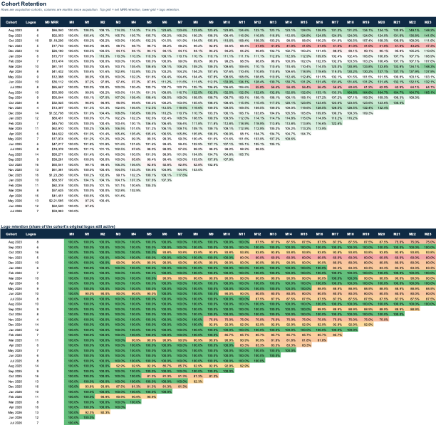
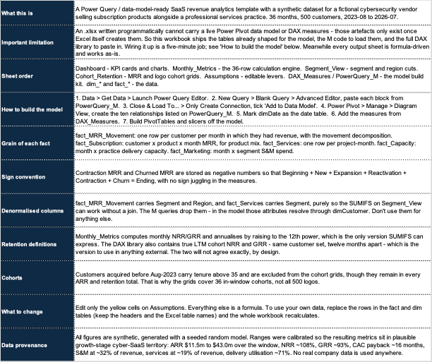
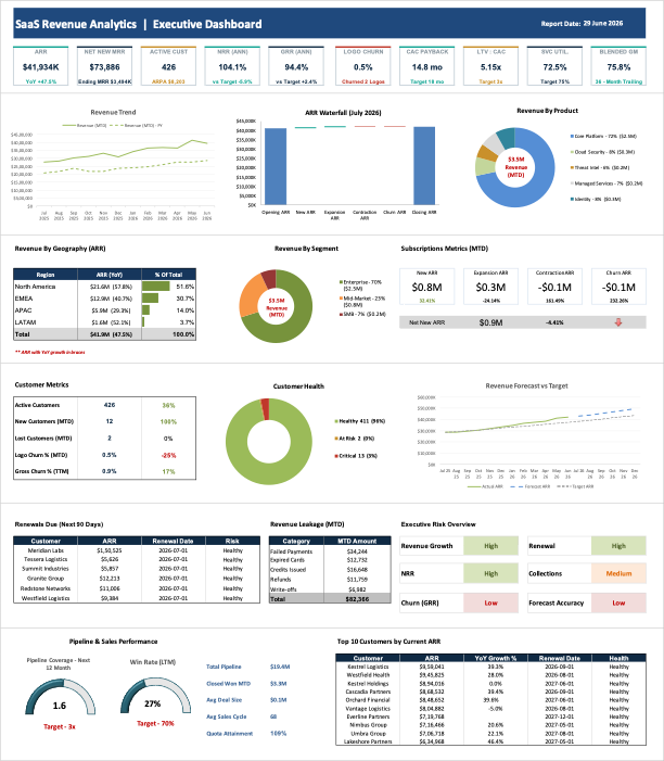
Enterprise-grade revenue analytics template built on a synthetic 36-month, 500-customer SaaS dataset — covering ARR/MRR movement, NRR/GRR retention, cohort analysis, CAC/LTV economics, services delivery, and executive KPIs, modelled entirely in Excel with a Power Query and DAX build kit.

Role BI & Analytics Lead
Industry SaaS / Cybersecurity
Scope Revenue Modelling · Retention Analytics · Executive KPIs
Tools Excel · Power Query · DAX · Python
01

Business Problem

Growth-stage SaaS companies typically track revenue health across a patchwork of spreadsheets — one for MRR movement, another for cohort retention, another for CAC and services margin — with no single view a CFO or board can trust.

This template centralises that reporting into one formula-driven Excel workbook, modelled on Sentinel Grid Security, a fictional cybersecurity vendor selling subscription products alongside a professional services practice. It uses a synthetic dataset — 500 customers over 36 months — built to sit in plausible growth-stage territory, so the mechanics generalise to any subscription business.

$43.0M ARR, +51.3% YoY
111% Net Revenue Retention
500 Customers · 36 Months
5x LTV : CAC
02

Model Architecture

ARR / MRR Waterfall NRR / GRR Retention Cohort Retention Grids CAC / LTV / Payback Services Margin & Utilisation Executive Risk Overview Revenue Leakage Pipeline & Renewals
  • 1

    Synthetic data generation

    Generated a seeded, reproducible dataset in Python — dimension and fact tables for customers, products, MRR movement, services, capacity, marketing, pipeline and leakage — calibrated to plausible growth-stage cyber-SaaS ranges.

  • 2

    Formula-driven calculation engine

    Built a 36-row Monthly_Metrics engine on SUMIFS / SUMPRODUCT rather than Power Pivot, so the workbook recalculates natively on Excel for Mac with no add-ins.

  • 3

    Power Query + DAX build kit

    Shipped the M code and full DAX measure library alongside the data, so the same tables can be wired into a live Power Pivot model and slicer-driven PivotTables in minutes.

04

Key Insights

📈

Expansion is outrunning churn

111% annualised NRR against 93% GRR shows expansion revenue from existing accounts more than offsetting contraction and churn.

🌍

Revenue is concentrated in North America

North America carries 57% of ARR at $22.0M, with EMEA at $13.0M — leaving APAC and LATAM as the smaller, faster-growth regions.

💰

CAC payback sits inside target

A 14.5-month payback against an 18-month target, with LTV:CAC above 5x, points to efficient go-to-market spend at current S&M levels.

🛠️

Services capacity is a watch item

Delivery utilisation near 75% against a 75% target leaves little slack — a signal to plan headcount ahead of continued ARR growth.

Executive Insight

Reading retention, geography and services capacity side by side turns three disconnected spreadsheets into one forward-looking view of where growth is efficient — and where it's about to get constrained.

05

Business Value

1
One source of truth for revenue Replaces scattered ARR, retention, and cohort spreadsheets with a single formula-driven model that recalculates end to end.
2
Board-ready in minutes KPI cards and movement waterfalls are structured for direct use in quarterly board and investor updates.
3
Portable to any subscription business Swapping in real fact and dimension tables — keeping the same headers and table names — lets the whole workbook recalculate against actual company data.
06

Tech Stack

Excel Calculation engine & dashboard
Power Query (M) Data model build kit
DAX Retention & cohort measures
Python Seeded synthetic data generation
Get the Template — Coming Soon on Gumroad
Contact

Let's build
something
that matters.

Open to Senior Manager, Director, and Head of Analytics roles in Bangalore, Hyderabad, and Dubai. Available for relocation or global remote.

LinkedIn linkedin.com/in/dilshad-yousuff-07b14714
GitHub github.com/yousuffd
E-Commerce BI · C-Suite Dashboard

Electronic Commerce
Intelligence Dashboard

A production-grade 5-page Streamlit platform giving C-suite executives a single pane of glass over 5,000 orders, 10 cities, and 10 product SKUs — with a real-time composite Health Score, Claude AI / GPT-4o board-ready insights, and a conversational "Ask the Data" interface. Supports CSV, XLSX, PostgreSQL, MySQL, and SQLite ingestion.

Dataset5,000 Orders · 5-Year Synthetic · 23 Fields
Data SourcesCSV · XLSX · PostgreSQL · MySQL · SQLite
StackPython · Streamlit · Plotly · Pandas · Claude AI / GPT-4o
PagesExecutive Summary · Revenue · Operations · Profitability · AI Insights · Ask
01

Business Problem

E-commerce leadership teams typically rely on fragmented exports and manually assembled decks to answer fundamental questions — revenue momentum, fulfilment health, margin erosion, and customer retention. There is no single platform that surfaces the right number for the right audience (CEO, CFO, COO) in one place, and almost none that converts raw order data into actionable board intelligence without a BI team in the loop.

This dashboard solves that by ingesting order-level data from any source, computing a composite Business Health Score (0–100) across five operational dimensions, and exposing five role-specific views — from an executive morning summary to a CFO-grade profitability breakdown — topped by AI-generated board narrative powered by Claude (Anthropic) or GPT-4o (OpenAI).

5KOrders in sample dataset
5Years of synthetic data (2020–2024)
23Engineered fields per order
6Dashboard pages
02

Data Architecture & Processing

The sample dataset is a realistic 5-year INR e-commerce simulation across 10 Indian cities (Mumbai, Delhi, Bengaluru, Hyderabad, Chennai…), 10 SKUs across 5 categories (Electronics, Fitness, Lifestyle, Smart Home, Footwear), and 8 acquisition channels (Direct, Google Ads, Organic, Email, Instagram, Amazon, Flipkart, Referral). YoY order volume grows from 10% weight in 2020 to 30% in 2024, with a 1.5–1.8× festive season spike in November–December.

order_id · order_date · product_name · category quantity · unit_price · revenue · city · order_status shipping_days · carrier · payment_method · channel gross_margin ← COGS per SKU is_perfect · is_delayed · sla_breach ← derived flags discount_amount · discount_pct · aov ← derived customer_segment: Loyal / Returning / New / At-Risk
  • 1

    Multi-source ingestion & column mapping

    Accepts CSV, XLSX, PostgreSQL, MySQL, and SQLite. A smart column mapper auto-detects synonyms for required fields (e.g. "sale_amount" → revenue, "ship_date" → order_date) and surfaces a UI-based override for any unresolved columns. Warnings are surfaced inline rather than failing silently.

  • 2

    Feature engineering — 23-field schema

    Derived fields include: AOV (revenue / orders), gross margin (revenue − COGS, with product-specific COGS ratios 35%–55%), is_perfect (delivered, not returned, not delayed), sla_breach (actual ship days > carrier-promised days), month / quarter / week for time aggregations, and customer_segment (Loyal / Returning / New / At-Risk) derived from repeat-purchase behaviour.

  • 3

    Business Health Score — composite 0–100

    Five weighted sub-scores are combined into a single executive KPI: Perfect Order Rate (×0.30), Refund Rate (×0.25), Cancellation Rate (×0.20), MoM Revenue Growth (×0.15), and Delay Rate (×0.10). A score ≥75 is green; 50–74 is amber; <50 triggers a red alert.

03

Dashboard Pages & Key Features

Six pages cover distinct executive audiences — each opening with the most important signal for that role and drilling into supporting analytics beneath.

📊

Executive Summary

5-KPI strip (Total Revenue, AOV, Perfect Order Rate, Revenue at Risk, Health Score) with MoM/QoQ deltas, dynamic exec alert banners (danger / warn / good), revenue trend + order volume overlay, city revenue bar, category donut, and a product revenue scorecard with return-rate pills.

📈

Revenue Deep-Dive

MoM waterfall (last 6 months), AOV trend line, category × product treemap, order status split, and revenue concentration alert (red if top-3 SKUs >70% of revenue, green if well-diversified).

🚚

Operations

Perfect Order Rate gauge (benchmark: 75%+), on-time delivery %, cancellation rate, city × month delay heatmap, shipping speed donut (Express 0–2d / Standard 3–4d / Slow 5–6d / Delayed 7d+), and per-city delay rate bar coloured red/amber/green.

💹

Profitability (CFO View)

Gross Margin %, Customer Repeat Rate, Avg LTV, Revenue Lost to Discounts — plus gross margin by category, acquisition channel revenue, new vs returning cohorts, discount impact overlay (gross vs net revenue), customer segment revenue, return reason breakdown, and SLA breach rate by carrier.

AI Insights + Ask the Data

The AI Insights page sends a structured business context snapshot (revenue, KPIs, top products, top cities) to Claude (Anthropic) or GPT-4o and streams back 6 board-ready insights covering revenue momentum, operational risk, market concentration, customer economics, logistics efficiency, and a forward-looking recommendation. A rule-based fallback fires automatically with no API key. The Ask the Data page extends this into a full conversational interface — executives can ask free-form questions and receive quantitative, board-appropriate answers grounded exclusively in the loaded dataset.

04

Business Value

1
Single C-suite pane of glass One app replaces fragmented CSV exports and manually assembled decks — surfacing the right KPI for each role (CEO / CFO / COO) through dedicated pages that open with the most critical signal first.
2
Proactive executive alerting Dynamic alert banners auto-fire when MoM growth drops below −5%, refund rate exceeds 8%, cancellation rate exceeds 5%, or Perfect Order Rate falls below 60% — removing the need for manual threshold monitoring.
3
Instant board narrative from AI Six quantified, board-appropriate insights are generated on demand by Claude or GPT-4o, covering every strategic dimension — from revenue concentration risk to city-level replication opportunities — with no analyst involvement required.
4
Source-agnostic deployment Works with any order dataset — CSV, XLSX, or live database connection — with auto-column detection and a UI mapper for non-standard schemas. Self-hosted on DigitalOcean with Nginx reverse proxy, SSL, and always-on systemd services — zero cold starts, full infrastructure control.
05

Tech Stack

Streamlit 6-page interactive dashboard framework
Python · Pandas · NumPy ETL, feature engineering, KPI computation
Plotly Waterfall, treemap, gauge, heatmap, donut charts
Claude AI (Anthropic) Board-ready insights + conversational Q&A
GPT-4o (OpenAI) Alternative AI insights provider
PostgreSQL · MySQL · SQLite Live database connectors via SQLAlchemy
View on GitHub View Dashboard